
Design trends 2019
Online design is constantly evolving. It is perhaps appropriate then that the underlying graphic design trends of 2019 are organic and embrace contradictions. It is important for your brand and the sentiment of your buyers. Whether you are looking to refresh some of the elements of your online branding or looking to design a website from scratch, here are the most important web design trends for 2019.
Organic and energizing colours
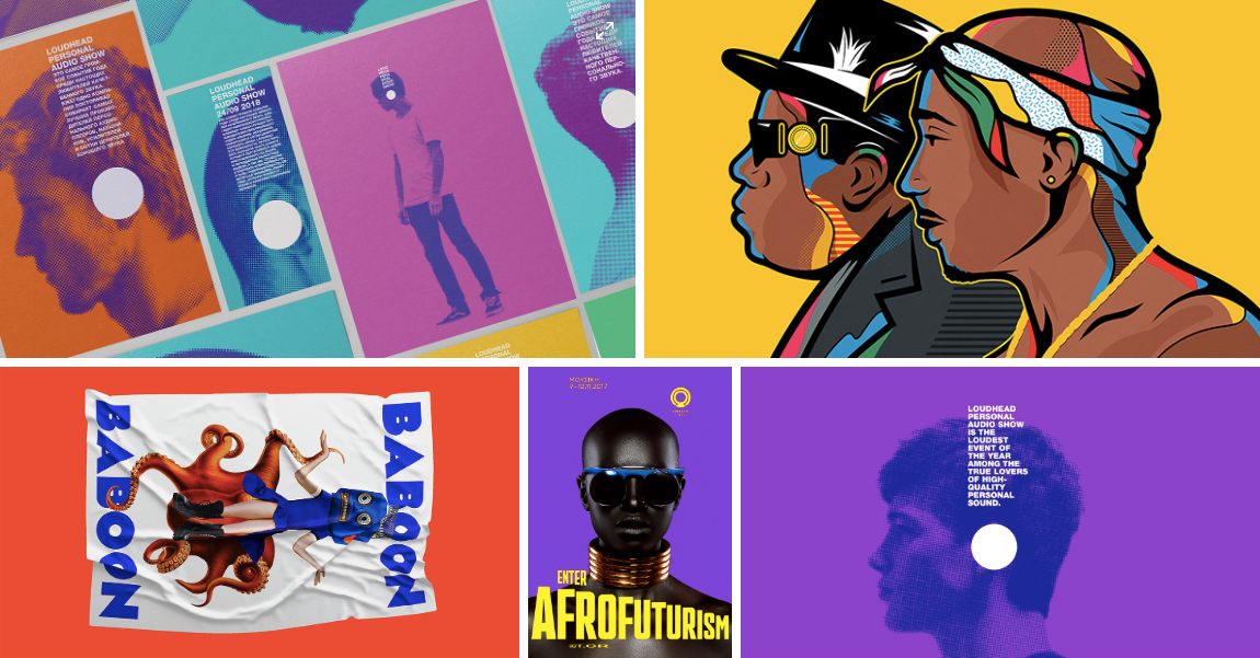
(1) Author: Vladimir Lifanov, Aslamova Viktoriya; (2) Author: Van Orton Design®; (3) Author:
Sagmeister & Walsh; (4) Author: Beetroot Design; (5) Author: Vladimir Lifanov, Aslamova Viktoriya
Each year the Pantone Color Institute announces its colour of the year. For 2019 Pantone declared that Living Coral was this year’s big colour. The colour was described as an animating and life-affirming colour with a golden undertone that both energizes and enlivens. According to Pantone Living, Coral reflects a buoyancy which is vibrant and connected with nature.
The selection of Living Coral as Pantone’s Colour of the Year is part of a wider movement towards a return to nature. As people have become overloaded by an overflow of digital content, there is a desire to return to more natural experience.
This is leading in turn towards designs and colours which reflect an experience which is more organic and simple. Coinciding with this is a desire for design which has a feeling of tactileness and approachability. Underlying this are consumers becoming increasingly concerned about the ethical impact of their purchases. Branding, which is able to reflect sentiment, can help to form a deeper connection between the buyer and the product.
Mid-century modern design
(1) Author: ANAMOLLY; (2) Author: spoon lancer
Mid-century modern design has made a comeback in the last twelve to eighteen months. This trend is likely to continue throughout 2019. Mid-century design was a style that was popular from approximately 1933 to 1965. Although some people would place the movement as being limited to 1947 to 1957.
The graphic design trend took place across a range of different areas, including architecture, product design, and interior design. It also found its way into product and graphic design. That influence has now been extended to web design as well.
The fundamental principles of mid-century modern design were the rejection of ornamentation, the embrace of clean lines and angles, and the use of geometric shapes. One of the most underlying principles of mid-century modern design was that form should follow function.
Mid-century modern design was in direct response to the popular styles that had come directly before. Where art deco was direct, mid-century modern design tended to be more minimalistic. It did, however, include some elements of art deco including the way in which line was used.
The rediscovery of mid-century modern design gained a lot of traction thanks to the popularity of the hit TV show Mad Men. As of 2019, this trend is now being embraced by tech startups and other websites. In particular, you can see it in the use of clearly mid-century design influenced illustrations.
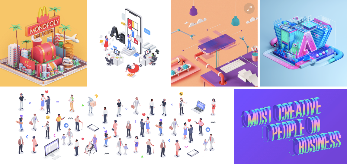
3D graphic design

(1) Author: spiilka design büro; (2) Author: Apus Agency
One of the most important web design trends of 2013 is a shift towards 3D design. What would have previously been presented in flat design is increasingly being shown as 3D. One of the areas that you can see that most prominently is in the use of characters. Characters that would have been presented in two dimensions are now frequently three-dimensional.
Another area that has been popular for 3D is in geometric shapes. Combining with the shift towards more organic and fluid shapes has been the adoption of 3D geometrical shapes. This opened up the ability to create more abstract composition and dreamlike environments.
Designers and artists are taking this further creating abstract figures presented in three dimensions. The embrace of 3D design combines with another web design trend for 2019, which is augmented reality. Designers are increasingly using 3D design as part of AR experiences. And with Snapchat, Facebook and Apple all supporting different augmented reality features this trend will only continue through-out 2019.
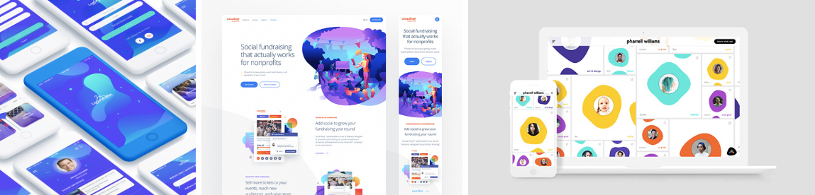
Flat Design meets Realism
One of the underlying themes of design in 2019 is the combination of elements that traditionally have been seen together. One example of this is the move to combine ultra-realistic elements with flat design. In addition to giving the page a fresh look, they also naturally draw attention to the realistic element.
In the past brands have traditionally chosen between either flat design OR realism. Flat design doesn’t make use of drop shadow and doesn’t have textures or gradients. It appears completely two dimensional and uses flat colours and simple text. In contrast, realism aims for a three dimensional look that mirrors that actual appearance of that object. It achieves this through the use of shadow and light in order to achieve depth. Realism will often make use of complex gradients and colour schemes. Realism can be seen in everything from photo realistic objects to 3D illustrations.
Flat design has proven to be a popular option with many websites. The reason for this is that flat design tends to scale well for mobile. Because flat designs require less coding, it also generally improves page load speed. For businesses with a heavy web presence, flat design has traditionally been a smart choice.
While flat design works great online, its popularity means that it has become somewhat cliche. Adding in more realistic elements, provides a new level of interest to re-engage viewers.
Isometric Design
(1) Author: MORPHINE Motion Graphics; (2) Author: Igor Kozak, Rocketboy Studio; (3) Author:
Cristian Malagón Garcia, Núria Madrid; (4) Author: Peter Tarka, Mateusz Krol; (5) Author: Igor Kozak, Rocketboy Studio; (6) Author: Mohamed Samir
Looking for the depth and realism of 3D design without the large file sizes? Then Isometric design is a trend for 2019 that you will want to take a look at. Isometric design provides a clean look while encouraging the interest of your website visitors.
Isometric design presents a 3D image but without any converging lines. This is important because converging perspective lines present objects the way that a human would see them. In contrast, isometric design shows the object the way that really is. In addition, isometric design always follows the principle of 120 degrees. This means that in order for a design to be isometric there must be a 120 degree angle between the X, Y and Z axis.
With isometric design it is possible to show not just one side of an object, but also the top or bottom. This allows the viewer to peer into that object.
Isometric design is useful for presenting clickable icons on a page. Because the icons have the appearance of depth, they appear to be raised out from the page. This makes it easier for the visitor to understand where they need to click.
Another area where isometric design is frequently used online is infographic elements. Isometric design allows you to create detailed and realistic looking infographics. Achieving the same level of visual interest with flat design would be challenging.
Open composition
Closed composition reflects stability and immobility. All of the elements sit within the frame of the website. In the past web designers have had a tendency to place each of the elements on a website within a neatly arranged frame. In 2019 we are seeing those designs being blown apart with more open compositions when brands design a website.
In open compositions the elements of the website seem to run off the sides and the edges of the picture plane. This gives the viewer the sense that what they are seeing extends beyond the limits of the website.
Open compositions spark interest because the viewer intuits that there is more to the design of what they are seeing. This design idea can be played with to encourage the viewer to move through the website. Open composition tends to create a sense of energy and movement because they are freed from the constraints of closed compositions.
Asymmetry
(1), (2) Author: CFC; (3) Author: Jason Miller, Mother Design
In the past web design has tended towards symmetry. This is not without good reason. The mind naturally structures visual data to create order. This creates a sense of stability which is pleasant to view. Many of the world’s most famous buildings are masterworks of symmetrical design.
Symmetry comes in three different forms. The first of these is reflection symmetry. This is where design is mirrored on a central axis. This axis could be horizontal, vertical or diagonal. On either side of the line, the image will mirror the other side. Rotational (aka radial) symmetry is where the design rotates around a common center. Each of the design elements will be equally spaced around this common center. Finally, there is translational symmetry where design elements are repeated at different locations in space while maintaining the same orientation.
Asymmetrical design removes the traditional balance to the page. The end result is greater tension that creates more energy and dynamism to the page. The easiest way to think of asymmetry is that it removes all of the forms detailed above which creates symmetry.
One of the reasons that asymmetry is less common than symmetry is that it can be difficult to do well. The relationships between different elements in asymmetrical design become more complex. The result is that it can be challenging to tie them together in an overall cohesive design. But when mastered, asymmetrical design can create an impact that symmetrical design doesn’t always deliver.
For websites asymmetry can also play a role in conversion optimization. The eye will naturally be drawn to elements on the page which are larger than those around it. This can provide a subtle way of drawing the visitors attention to key elements on the page.
Liquidity
(1) Author: Mariusz Mitkow; (2) Author: Eddie Lobanovskiy; (3) Author: Tal Midyan, Lillie Ferris
Incorporating liquid elements into design is another ecommerce website design trend for 2019. Oil, paints and water are just some of the areas that designers are playing around with. Liquids allow for a large degree of experimentation and play. This is because of the ability to change the viscosity and flow.
Liquids play into the large shift towards more organic imagery in design. In 2019 we can expect to see plenty of liquid design which reflects a harmonious relationship with nature. However, liquids can be equally used to unsettle with melting and dripping elements.
Improvisation
In 2019 we see a lot more improvised design elements on the page. These can include doodles, spots and stains. With a hand-drawn look they provide interest and playfulness to the designs. These hand-drawn elements are typically combined with more traditional design elements.
Most designs begin with sketches. These will then be translated by the designer through photoshop or other design programs before being used on the web. In 2019 we are seeing more of those sketches finding their way back onto the website design.
Improvisation relates to the larger embrace of organic and playful elements. As with open composition, web designers are freeing themselves from constraints and what has traditionally been called good web design principles. The sense of spontaneity that improvised doodles or sketches deliver connects the brand with their audience.
Subtle Micro Interactions
On page animations have certainly not disappeared, but what we are seeing is a shift toward more subtle micro-interactions. Rather than using animation which screams out for attention, these micro-interactions are meant to surprise and delight the visitor. Used carefully, they provide interest for the visitor as they navigate through the on-page elements.
Micro-interactions are on page animations which only have a single purpose. Micro interactions may seem less important because they don’t call attention to themselves. But in fact it is the attention to detail and the ability to delight, which makes subtle micro interactions so important. They humanize the website, forming a deeper connection between the brand and the consumer.
Custom Fonts
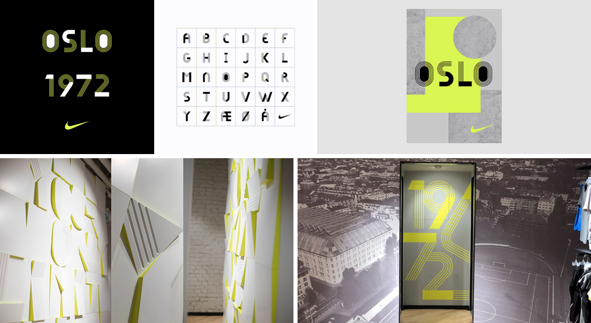
Author: Hans Christian Øren
Companies are looking for a way to distinguish themselves in what is an increasingly competitive online field. One way that is aiming to achieve this is through custom fonts. Custom fonts allow brands to create a font which fully expresses the individuality of that company. At the same time, it provides a design element which no other brand is able to copy. Having a custom font provides a unique yet affordable way for companies to distinguish themselves, so you can expect to see this design trend continues to boom in 2019.
Integrating your design
It is important to create consistency in the design for the different elements of your website. One of the benefits of Bookly is that it provides plenty of room for customization. This means that you can implement cutting-edge design, without having your booking form looking out of place.


